
Mutual funds investments
Mutual fund investing built into MTN MoMo, shipped on two surfaces at once: a 182-character USSD flow for feature phones and a native app for smartphones. Designed for SecondSTAX, covering onboarding, investing, portfolio, redemption, and complaints across Ghana, Nigeria, and Kenya. Available in two formats below.
- Role
- Product Designer
- Type
- Mutual fund investing inside a mobile money super-app
- Platform
- USSD (feature phone) and native iOS / Android
- Tool
- Figma
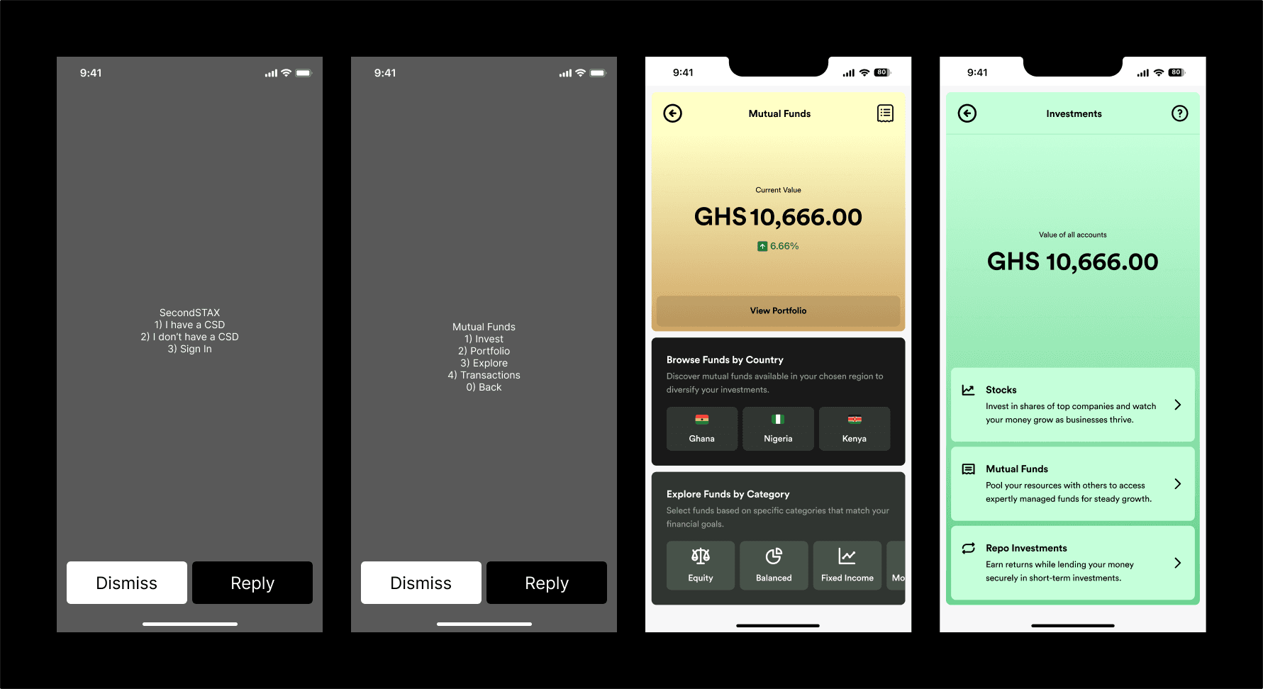
A mutual fund fact sheet runs to several pages of tables. USSD gives you 182 characters, no images, no scrolling, and a session that expires while you are still deciding. Somewhere in Accra, someone with a feature phone and a MoMo balance wants to put GHS 100 into a balanced fund. The same week, someone with a new Android phone wants to do exactly the same thing, and expects to see a chart before they commit. Both of them are the customer, and neither is going to read a prospectus. The distance between what a regulated investment product has to disclose and what the screen can physically hold shaped nearly every decision in this project.
Overview
SecondSTAX is capital markets infrastructure for Africa, connecting investors to securities exchanges across multiple countries. This project put mutual fund investing directly inside MTN MoMo, the mobile money service, so that anyone with a MoMo wallet could buy into a fund without going through a brokerage app or a branch visit.
The work covers two complete surfaces designed in parallel: a USSD flow for feature phones and low-end handsets, and a native app flow for smartphones. Both cover the full journey, from account setup through investing, portfolio tracking, redemption, transaction history, statements, and complaints. Mutual funds sit alongside two sibling products in the same investment hub, stocks and repos.
The Problem
For the investor. Buying into a mutual fund in Ghana traditionally means finding a broker, opening a Central Securities Depository account, completing KYC in person or by email, and funding the account by bank transfer. Every step is a place to give up. Meanwhile the money that would be invested is already sitting in a MoMo wallet, doing nothing.
For the fund managers. Ghanaian fund managers have distribution ceilings set by how many people will physically walk into an office. There was no low-cost channel for reaching someone who wants to invest GHS 100, and the cost of servicing that customer through traditional channels exceeds what the customer is worth.
For SecondSTAX. The business thesis is cross-border access, letting a Ghanaian investor reach Nigerian or Kenyan funds and back again. That only works at scale if the entry point is something almost everyone already has. MoMo has that reach, but MoMo's reach includes millions of people on feature phones, which means USSD cannot be treated as a degraded fallback. It is a primary surface serving a primary customer.
Design Philosophy
One rule sat underneath the whole project and settled most of the arguments about what to cut:
Three things followed from that.
Verbs, not features. Both surfaces are organised around Invest, Portfolio, Explore, and Transactions. Those four words are what a person is trying to do, and they survive translation to a numbered menu without becoming jargon.
Say the expensive thing early and say it again late. In a product that charges a fee for leaving too soon, disclosure cannot live only in terms and conditions. The 365-day holding term appears at three separate points, getting more specific and more personal each time.
Do not pretend the channel can do what it cannot. USSD cannot complete regulated identity verification. Rather than building a fake KYC flow that fails at the end, the design collects the minimum, hands off to a licensed broker, and tells the user exactly what will happen next.
Process
The two surfaces were designed against a shared information architecture rather than sequentially. Working out the menu structure once, then testing it against the harder constraint first, meant the USSD limits shaped the app's structure instead of the app's ambitions producing a USSD flow that could not carry them.
USSD came first for structural decisions. If a concept could not be expressed in 182 characters of numbered options, it did not go into the app's navigation either, it went into the app's detail layers. That kept the two surfaces genuinely parallel at the top level.
Each flow was built out to include its failure states rather than the happy path alone. Both authentication flows carry incorrect-entry and verification-successful states. Redemption carries an interstitial confirmation. Complaints carry a submitted state. For a product moving real money, the confirmation and error screens are the product.
The USSD Surface
Getting in
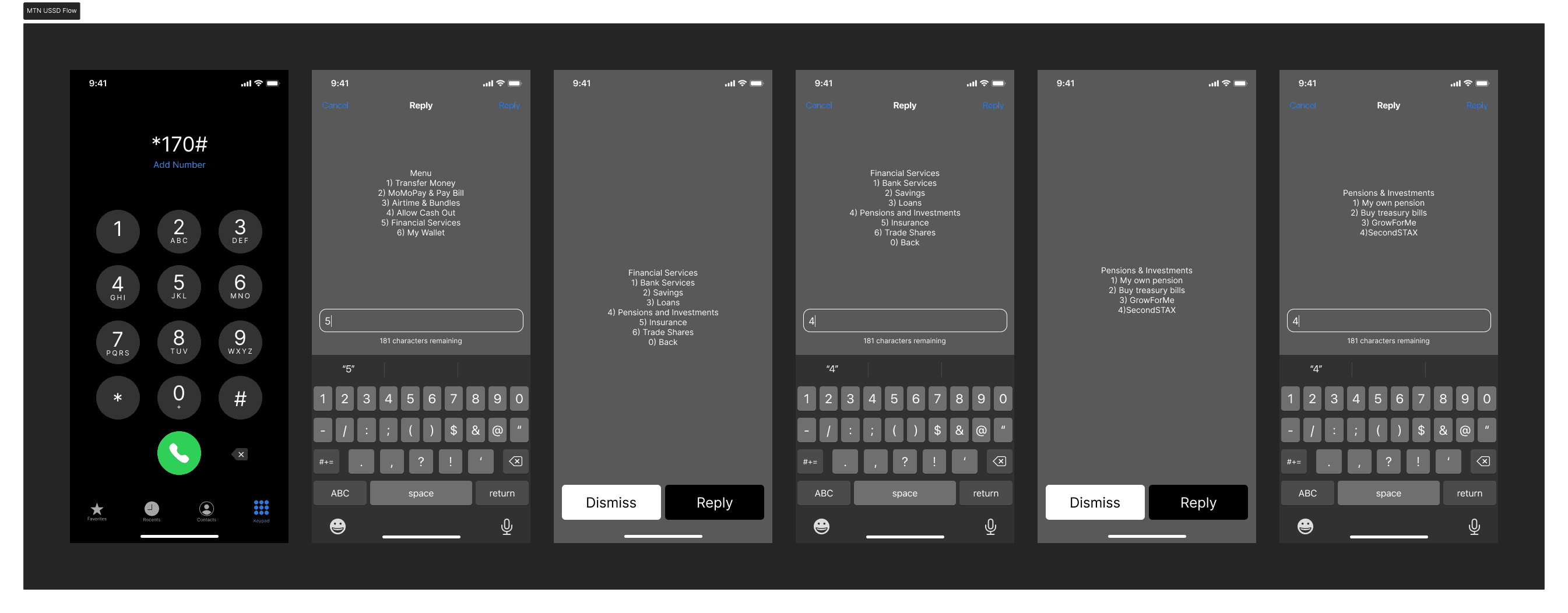
SecondSTAX does not own the front door. The path runs *170#, then Financial Services, then Pensions and Investments, then SecondSTAX, and only then into the product. Four levels of someone else's menu structure before the first screen this project controls. That constraint is worth naming plainly, because it sets the tone for everything after it: this is a guest inside a super-app, and the design has to earn attention from someone who has already pressed four buttons.
The account fork
The first SecondSTAX screen asks one question that determines everything after it.
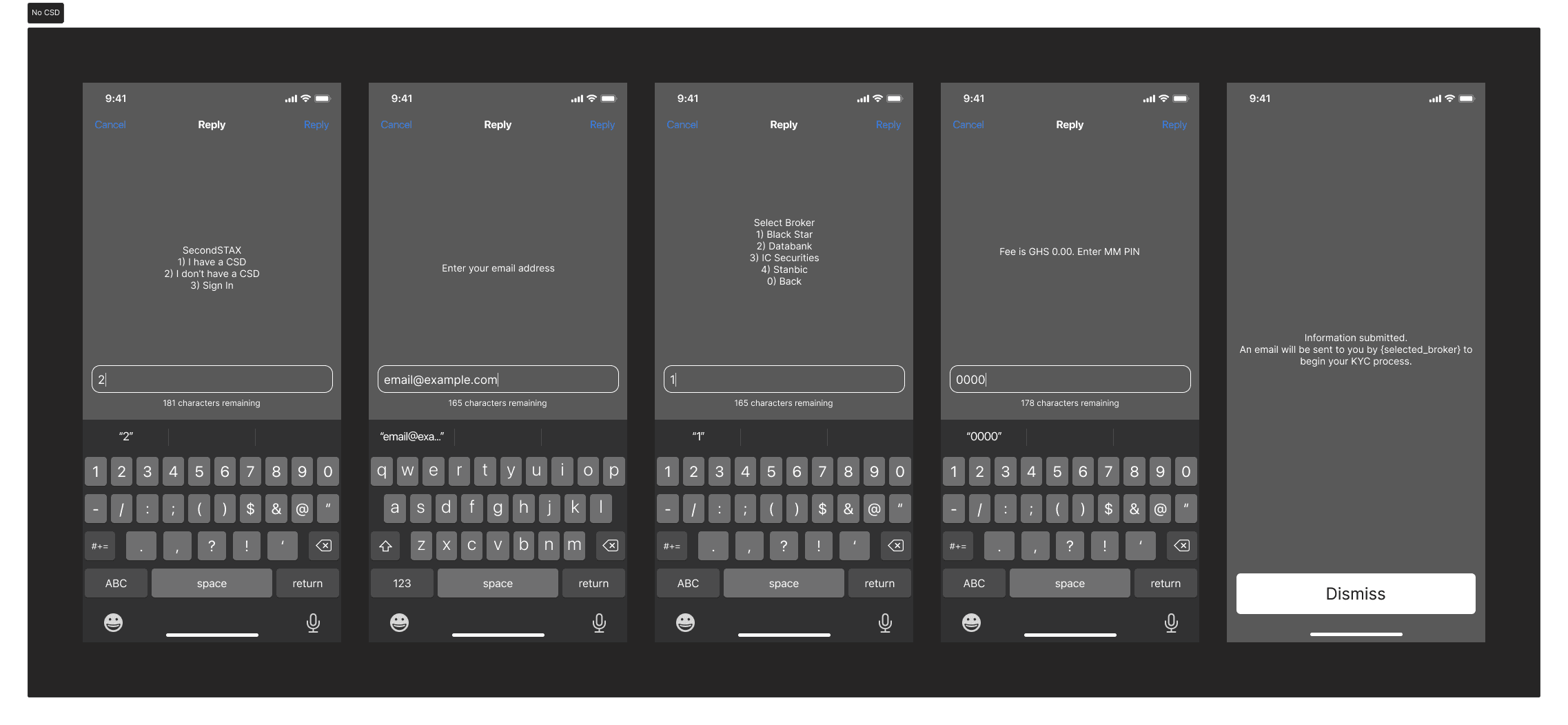
SecondSTAX 1) I have a CSD 2) I don't have a CSD 3) Sign In
A Central Securities Depository account is legally required to hold securities in Ghana, and most MoMo users do not have one. Existing account holders enter an email address and an activation code and are into the product in two steps. Everyone else enters an email, chooses a broker from four licensed options, confirms with their MoMo PIN, and lands on a screen that sets an honest expectation:
Information submitted. An email will be sent to you by {selected_broker} to begin your KYC process.
This is the most important decision on the USSD surface. Identity verification for securities ownership requires document checks that cannot happen over a numeric keypad, so the flow does not attempt them. It collects what it can, routes to a party that can finish the job, and names that party so the follow-up email is not mistaken for phishing. The alternative, an onboarding flow that runs for ten screens and then fails, would have burned the channel.
Designing to 182 characters
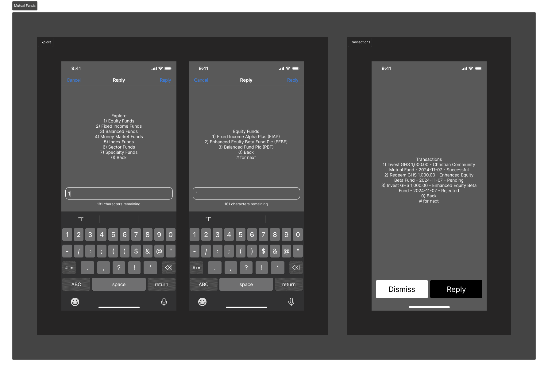
Every USSD screen in this project is written against a hard ceiling. The main menu comes in at 70 characters. The fund list runs 135. The category browser reaches 143 and could not take another option without breaking.
When content genuinely exceeds one screen, the flow paginates with # for next rather than truncating. The transaction list is the clearest case, running past 250 characters because each entry has to carry an action, an amount, a fund name, a date, and a status:
Transactions 1) Invest GHS 1,000.00 - Christian Community Mutual Fund - 2024-11-07 - Successful 2) Redeem GHS 1,000.00 - Enhanced Equity Beta Fund - 2024-11-07 - Pending 3) Invest GHS 1,000.00 - Enhanced Equity Beta Fund - 2024-11-07 - Rejected 0) Back # for next
Nothing in that string is decoration. Drop the date and the user cannot reconcile against their MoMo statement. Drop the status and a pending redemption looks identical to a completed one. The pagination exists because the content genuinely could not be cut further, which is a different situation from pagination used to avoid making a decision.
Fund names carry ticker abbreviations on USSD, so Fixed Income Alpha Plus (FIAP) can be referenced compactly on later screens. The app, with room to spare, spells fund names out in full every time.
Money in, money out
The invest flow runs country, fund, amount, confirmation, PIN, receipt. The confirmation screen carries the full cost picture before the PIN prompt, including projected returns, transaction fee, and tax, even when the fees are zero. Showing Fee is GHS 0.00 rather than hiding the line matters here, because a user who has been burned by hidden charges elsewhere reads a missing fee line as a fee not yet disclosed.
Redemption mirrors the same shape and ends on submitted rather than completed:
Redemption request of GHS 1000 of Fixed Income Alpha Plus (FIAP) has been submitted.
That wording is doing real work. Fund redemptions settle over days, not seconds. A message saying the money had been sent would generate a support call the moment the wallet balance failed to move.
The App Surface
Where it sits
Inside the MoMo app, Investments is one tile among Bundles, Transfers, Airtime, Utilities, TV, and Merchant. Tapping it opens a hub showing the combined value of all accounts and three products: Stocks, Mutual Funds, and Repo Investments, each with a one-line description written for someone who has never bought a security.
Mutual funds gets its own home screen carrying current value, growth percentage, and two entry points into discovery: browse by country, and explore by category.
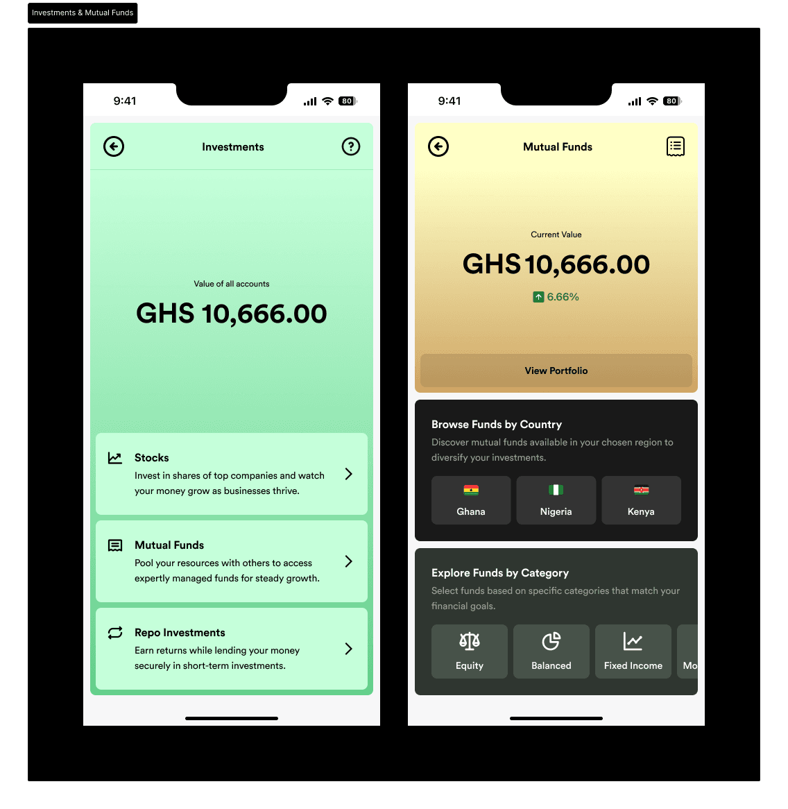
Country is not a filter, it is the thesis. Ghana, Nigeria, and Kenya sit at the top of discovery because cross-border access is what SecondSTAX exists to provide. Putting country selection behind a filter menu would have buried the single thing that differentiates the product.
The fund card
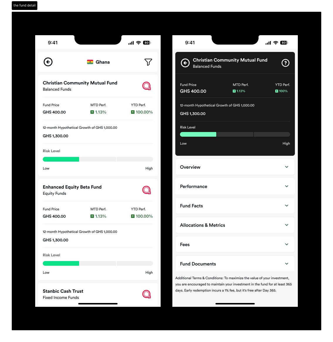
Every fund is summarised with the same five signals: price, month-to-date performance, year-to-date performance, a twelve-month hypothetical growth figure on a standard GHS 1,000, and a risk level shown as a three-segment bar from Low to High.
The hypothetical growth figure is normalised to the same starting amount across every fund, which makes funds comparable at a glance without the user doing arithmetic. Below the summary, the detail page collapses everything else into accordions: Overview, Performance, Fund Facts, Allocations and Metrics, Fees, and Fund Documents. The regulatory disclosure is present and complete, and it is folded away until asked for.
The growth ladder
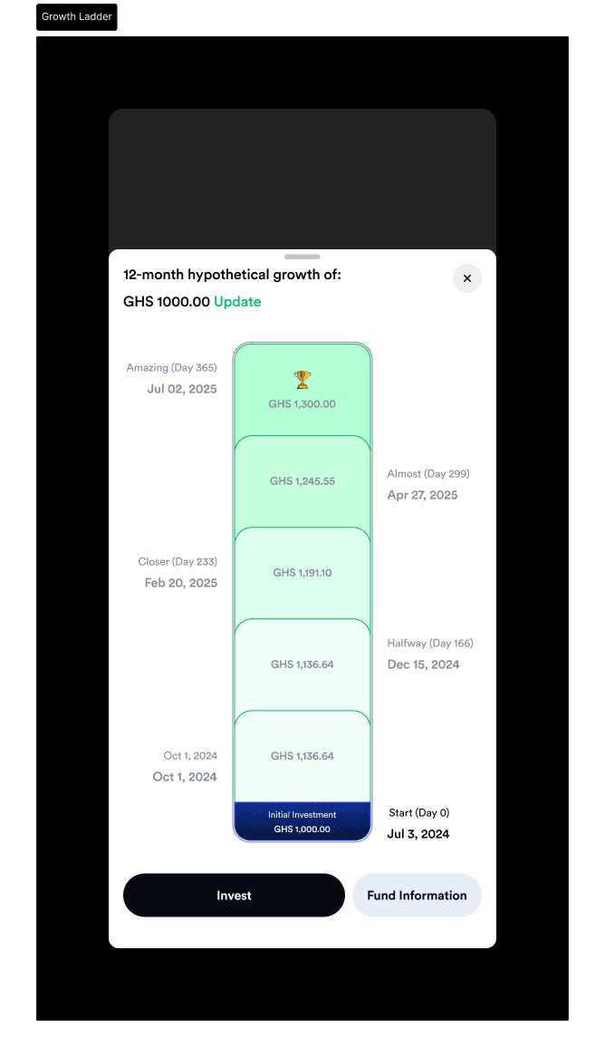
The most distinctive screen in the project shows a twelve-month projection as a vertical stack rather than a line chart.
The initial investment sits at the bottom as a dark navy block. Above it, growth accumulates in progressively brighter green segments, each labelled with a date, a projected value, and a name: Start (Day 0), Halfway (Day 166), Closer (Day 233), Almost (Day 299), Amazing (Day 365). A trophy sits at the top. Labels alternate left and right so nothing crowds. The amount is adjustable, so a user can model their own number rather than the GHS 1,000 default.
The named milestones do something a date axis cannot. They give a holding period an emotional shape, and they align the interface with the fund's actual terms, since early redemption before Day 365 carries a fee.
The same ladder, inverted
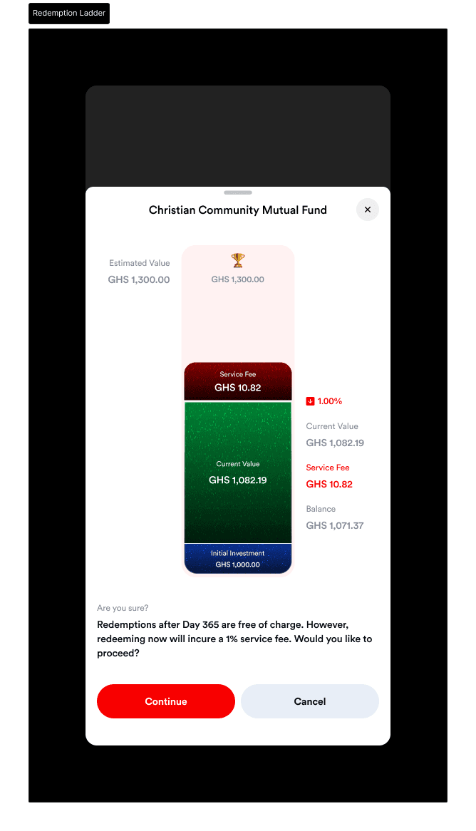
The redemption confirmation reuses the growth ladder and recolours it to show what leaving early costs.
The projected top, the GHS 1,300 with its trophy, fades to pale pink. A dark red block appears for the service fee, GHS 10.82 on a current value of GHS 1,082.19. The remaining balance sits below it. The copy is direct: Redemptions after Day 365 are free of charge. However, redeeming now will incur a 1% service fee. Would you like to proceed?
Disclosure in three passes
The 365-day holding term is stated three times, and it gets more specific each time.
On the fund detail page it is a static footnote applying to everyone. On the investment confirmation it appears at the moment of commitment, still general. On the redemption confirmation it becomes personal and computed, naming the exact fee against the exact balance, with a cancel option weighted equally against continue.
A fee disclosed once in terms and conditions is technically compliant. A fee disclosed at the moment it is about to be charged, in cedis, is the version that prevents the complaint.
Amount presets
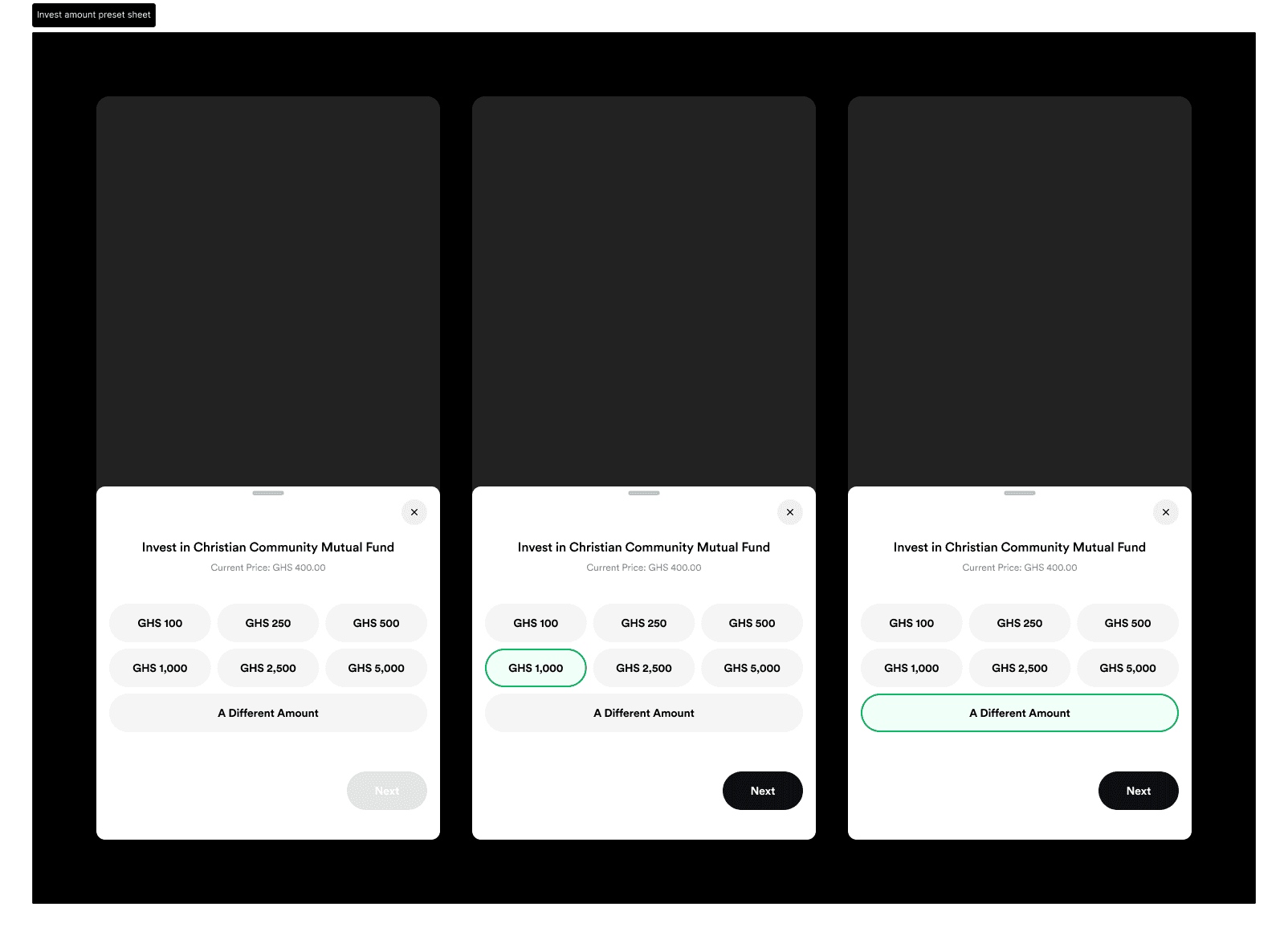
Investing starts with preset chips rather than an empty number field: GHS 100, 250, 500, 1,000, 2,500, 5,000, and A Different Amount. Presets remove the hardest part of a first investment, which is not the mechanics but deciding how much is a normal amount to risk.
The Invest More flow drops the lower presets and opens at GHS 1,000. Someone adding to a position they already hold has already answered the question a first-time investor is stuck on, so the anchors move up to match.
Two different keys for two different doors
Investing is authorised with the MoMo PIN. Redemption is authorised with an OTP. Both carry incorrect and verification-successful states.
The asymmetry tracks risk direction. Money moving into a fund is recoverable and follows the same pattern as every other MoMo payment, so it uses the credential users already know. Money moving out is the transaction an attacker with a borrowed handset would target, and an out-of-band code is a meaningfully different check.
Everything Around The Money
Three flows exist that no feature list would have prioritised and every regulated financial product needs.
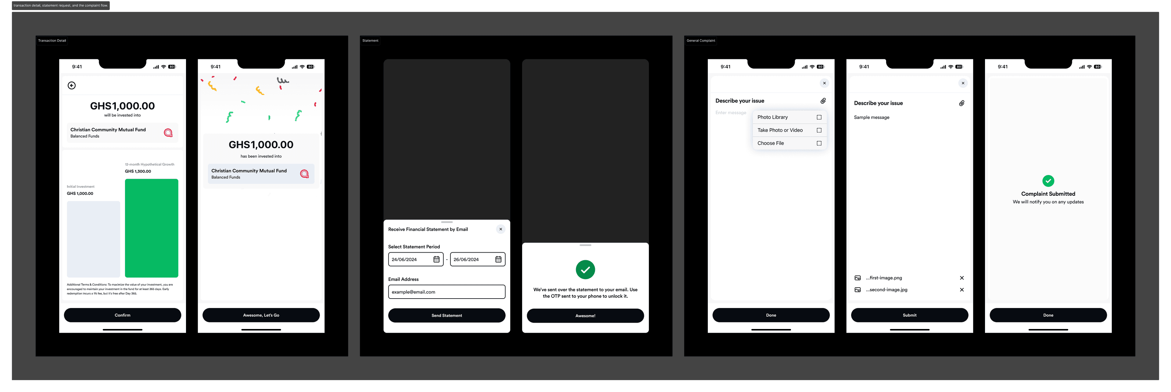
Transactions group by Today, Yesterday, and date, with in-progress states written as processes rather than outcomes, Processing redemption request. Each entry opens a detail view carrying subtotal, taxes, total, date, transaction ID, type, and status. The transaction ID is there so a support conversation has a reference number.
Statements are generated by date range and sent to an email address rather than displayed in the app. A statement is a document people forward to a bank, an accountant, or a tax authority, so delivering it to a place it can be forwarded from is the point.
Complaints are a designed flow, not a support link. The user picks a category from Fund Performance, Transaction Issue, or Payment-Related Issue, writes a description, attaches images, and receives confirmation that updates will follow. Image attachment matters because the most common complaint evidence is a screenshot.
Key Decisions and Resolutions
One IA across both surfaces. Invest, Portfolio, Explore, and Transactions on USSD and in the app, in the same order. A user upgrading from a feature phone relearns nothing, and support staff talk both users through the same structure.
USSD designed first, not ported down. Structural decisions were tested against the tightest constraint before the app added richness, so the two surfaces stayed genuinely parallel rather than the app defining a shape USSD could not hold.
KYC handed off rather than faked. Onboarding without a CSD account collects the minimum, routes to a named licensed broker, and sets the expectation in writing.
Ladder over line chart. Hypothetical growth is shown as named milestones stacking upward, which reads without chart literacy and does not imply a forecast.
The ladder reused for redemption. The same visualisation, recoloured, shows what early exit costs, so no second visual language has to be learned at the worst moment.
Zero fees shown explicitly. Fee is GHS 0.00 rather than an absent line, because an absent line reads as an undisclosed charge.
Redemption says submitted, not sent. Settlement takes days, and promising completion would generate support load and mistrust.
PIN to invest, OTP to redeem. Authentication strength follows the direction of risk.
Learnings
A constraint that severe is a design tool, not an obstacle. Writing the product to 182 characters forced decisions about what each screen was actually for. The USSD menus are the clearest articulation of the product in the entire project, and the app is better for having been structured against them rather than the reverse.
Visual metaphors are worth reusing when the stakes invert. Building a second visualisation for redemption would have been easier and worse. Recolouring the growth ladder meant a user facing a fee already knew how to read the screen telling them about it.
Disclosure has a timing dimension, not only a content one. The same sentence about a 1% fee does different work in a fund fact sheet, on a confirmation screen, and computed in cedis at the moment of exit. Compliance asks whether it was said. Design asks whether it was said when it could still change the decision.
Designing inside someone else's product changes what you control. Four levels of MoMo menu sit above the first screen this project owns. Accepting that, rather than designing as though the product were the whole phone, produced better decisions about how much orientation each entry point needed.
What Was Designed
A complete USSD product across five flows: entry and account setup with a CSD fork and broker handoff, sign in, invest, portfolio with per-fund and total balance views, explore by category, redemption, and transaction history. A parallel native app covering the investments hub, mutual funds home, discovery by country and category, fund detail with full regulatory disclosure, the hypothetical growth model, invest and invest-more flows, redemption with fee confirmation, transactions with detail views, statement requests, and a categorised complaints flow with attachments. Both surfaces include their authentication, error, and confirmation states. Stocks flows for buy and sell, covering market and limit orders, were designed alongside as a sibling product.
What Comes Next
The repo investments product appears in the hub and has not been designed. Empty states across portfolio and transactions need building, along with the behaviour when a fund is unavailable in a selected country. The pan-African promise implies currency handling across cedi, naira, and shilling that the current screens only gesture at. On USSD, session timeout and recovery deserve explicit design, since a session that expires mid-investment is the most likely real-world failure and currently has no designed answer.
Reflection
Most investment product design assumes a smartphone, a data connection, and a user who can read a chart. This project could assume none of those things for a large share of its audience, and the interesting part was discovering that the constraint improved the product rather than limiting it.
The 182-character limit made the proposition legible. The absence of images forced the value into the words. And the one screen with room to be expressive, the growth ladder, earned that room by doing a job the USSD flow genuinely could not do: making a year feel like a distance you could cross.
Showing the full case study.