
StubHub Design System
Design system recovery and governance for a live-events ticketing marketplace, after the entire design team was laid off. Solo on the system for the first eight months, alongside three or four other designers who each owned a different product domain, before a second design system designer joined. Reported to a China-based design manager. Available in two formats below.
- Role
- Lead Design System Designer, solo for the first eight months, then joined by a second design system designer.
- Type
- Design system recovery, governance, and cross-team enablement
- Platform
- Web (StubHub.com), consumed via a React core component library
- Tools
- Figma, FigJam, Storybook, Abstract, Zeroheight, Azure DevOps
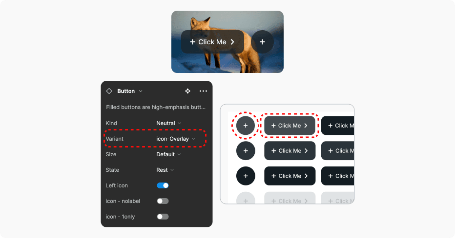
Somewhere around component two hundred, I stopped opening Figma first. I'd pull up the actual TypeScript source in Azure DevOps, trace down the real hex value or spacing token being shipped, and only then rebuild the Figma component to match it. StubHub had let go of its entire design team during the pandemic, and in the months before anyone was hired back, the Figma library had quietly drifted away from what was actually in production. Nobody had lied about what the design system was. There had just been no one left to keep it honest. My job, for a good chunk of the next year, was to make it honest again, one component at a time, before I was allowed to touch a single opinion about how the system should actually look.
Overview
StubHub laid off its entire design team during the pandemic. By the time hiring resumed, the design system that existed in Figma (originally built in Sketch) and the design system that actually shipped, in a React core library maintained by engineering, had drifted apart with nobody watching the gap. I was one of the first designers hired after that gap, and the design system was my full-time assignment. This case study covers the first phase of that work: getting Figma and production back into a single, trustworthy source of truth, before either one could be meaningfully improved.
The Problem
For designers. With no design system owner for months, each product team had started building its own version of common elements: banners, dropdowns, buttons, styled to match their own product area rather than a shared library. Nobody was doing this out of carelessness. There was nothing central and current enough to pull from instead.
For engineers. The core component library on Azure DevOps had continued shipping the whole time, but with no design counterpart tracking it. Components existed in code with no Figma equivalent, arguments over spacing and states got resolved ad hoc in pull requests, and there was no reliable way to tell a designer's intent from an engineer's improvisation.
For the wider org. A later survey of the team put a number on what this cost: engineers described the core library as "a black hole," designers said there was "no correlation between what's in production and what the design system keeps," and one product manager flagged that inconsistent CTA colors across the site, purple in one place, turquoise in another, both meaning "act now," were plausibly costing conversion, not just looking untidy.
Design Philosophy
Before I could improve anything, I had to decide what "correct" even meant when Figma and production disagreed. The rule I held for the whole first phase:
Two things followed from that.
Match before you improve. Every instinct I had to fix a spacing value or simplify a color ramp while migrating had to wait. Mixing "getting Figma accurate" with "making the system better" would have made it impossible to tell, later, whether a discrepancy was a bug or a deliberate change.
Give people a legal way to break the rules. A design system that says no to every new pattern just pushes people to build it anyway, off to the side, where nobody can see it. The healthier answer was a sanctioned space for exactly that impulse, which is what the Temporary Design System file became.
Process
The Sketch-to-Figma migration. My first task was moving the existing design system, through Abstract, out of Sketch and into Figma. That alone touched over 500 components. Once it was in Figma, I audited it against what was live in production, and that's where the real gap showed up.
Reading the code as source material. For components that existed in production but not in the migrated file, or that had drifted from it, I read through the core library on Azure DevOps directly, mostly TypeScript, to find the actual values in use, and rebuilt the Figma component to match. This took a couple of months and was genuinely tedious, but it meant that by the end, the entire library was a 1:1 match with what shipped. It also meant I became the person other designers came to when they needed to know what a component actually did in code, which sped up cross-functional conversations well beyond just design system work. I did this stretch solo, working alongside three or four other designers who each owned a different product domain, for about eight months before a second design system designer joined and the two of us carried it together.
Mapping the journey before comparing screens. I led a workshop to map StubHub's end-to-end product journey, so we had a shared view of the key screens across the platform and could compare them directly for inconsistency, instead of relying on individual designers noticing drift in their own product area.
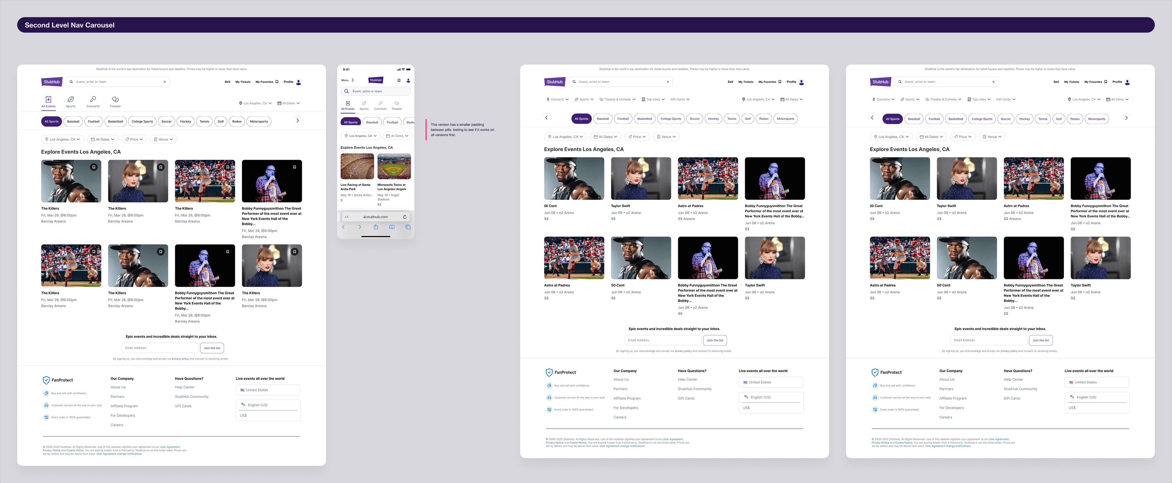
A living source of truth. I built and kept updating a source-of-truth file that mirrored what was in production, and used the same file to sketch a vision of what the platform could look like once the system caught up. Keeping both versions, current-state and vision, in one file made it easier to align engineering and design on what was a bug versus a deliberate future direction.
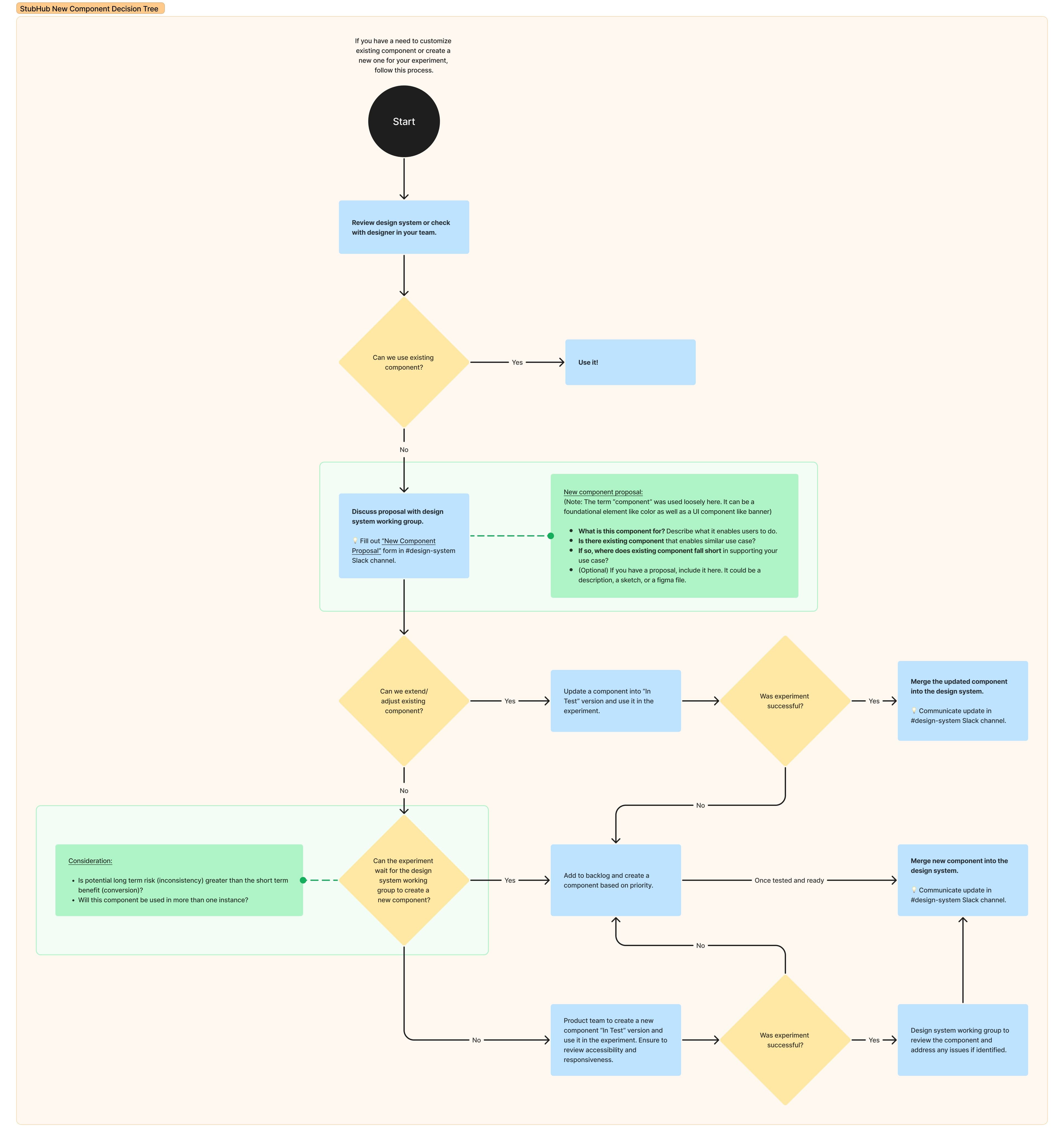
A decision tree for new components. To stop the "everyone builds their own version" problem from just repeating itself once the library was accurate, I built a decision tree in FigJam that any designer could follow when they thought they needed something new: check for an existing component first, then check whether an existing one could be extended, and only then propose something genuinely new to the design system working group, through a structured Slack form ("what is this for," "what's the closest existing component," "where does it fall short"). Anything that made it past that gate got built as an "In Test" version and run as a real experiment before being merged and announced.
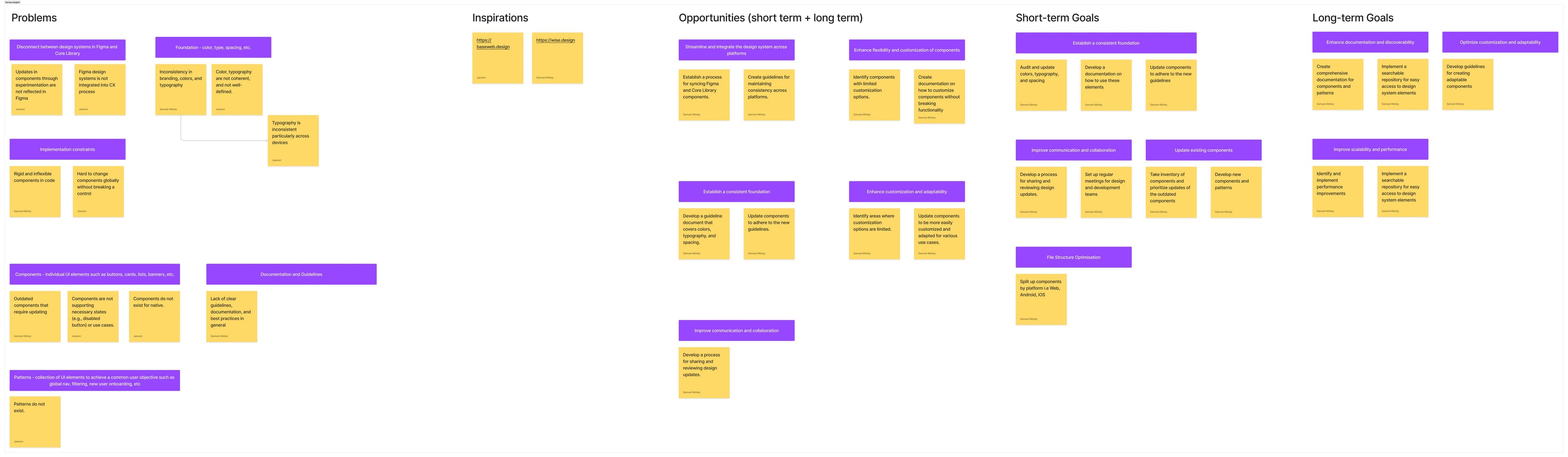
A survey to point the next phase. Once the baseline was solid, I ran a survey across engineers, designers, and PMs to understand how people actually used the library day to day: what worked, what they avoided, what was missing, and where documentation failed them. That survey became the direct input for the roadmap that followed.
Design System
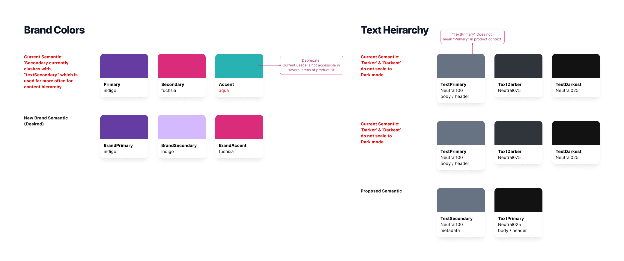
The design system itself covers a full component library (buttons, inputs, banners, modals, navigation, and the rest of what a component library at StubHub's scale needs), plus a color system that was actively being re-worked. Survey responses were consistent on where color was breaking down: primaries like purple, pink, and teal were being used interchangeably in ways that created confusing hierarchies, and a lot of grey usage read as disabled-state styling even when the element was fully interactive. I started a color semantic mapping exercise to move the system away from ad hoc hex choices and toward named, purpose-built tokens, work that continued past the scope of this first phase.
Key Debates and Resolutions
Fix it now vs. match it first. Chose to match production exactly before making any improvements, so later changes could be evaluated on their own merits instead of tangled up with cleanup.
Lock the system down vs. leave an escape valve. Chose to leave one: the Temporary Design System file gave designers a sanctioned place to build ahead of the working group process without fragmenting the real library further.
Redesign top-down vs. survey first. Chose to survey the team that actually used the library daily before deciding what to fix, so the roadmap was built on where people were actually getting stuck rather than on my own assumptions.
Zeroheight vs. build institutional knowledge some other way. Zeroheight had the original documentation, but it was far enough out of date that using it caused more confusion than it solved, so I stopped treating it as a reliable source partway through and relied on the code and direct conversations instead.
Learnings
A design system is only as true as its least-maintained migration. The gap between StubHub's Figma and production wasn't caused by bad design decisions, it was caused by nobody owning the sync for months. That's a governance failure, not a taste failure, and it needed a governance fix (an owner, a process, a decision tree), not just a redesign.
Freedom needs exactly one legal outlet, not zero. Banning new components without giving people anywhere to put new ideas just pushed the problem underground, into every individual product file. One sanctioned escape valve, the Temporary Design System file, solved more of the inconsistency problem than any amount of enforcement would have.
Inconsistency complaints are sometimes disagreements wearing a hex code. The PM's callout about purple versus turquoise CTAs wasn't really about color, it was about which team's convention should win. Design systems work at this scale means resolving organizational disagreements as often as it means resolving visual ones.
Most of the job never touches a screen. Between the code audits, the journey mapping, the decision tree, and the survey, the actual visual design work was a small fraction of this project's first year. Managing a system at this scale is closer to running a small internal product than it is to producing artifacts in Figma, and that's the part of the role I found I wanted more of.
What Was Designed
The Sketch-to-Figma migration and code-level audit of 500+ components. A Temporary Design System file used across the design team as an interim workflow. A full journey map of the StubHub product. A living source-of-truth file covering both current-state and future-vision. A new-component decision tree with a structured intake process. A team-wide survey across engineering, design, and product, feeding directly into a three-phase improvement roadmap. Early color semantic mapping work.
What Comes Next
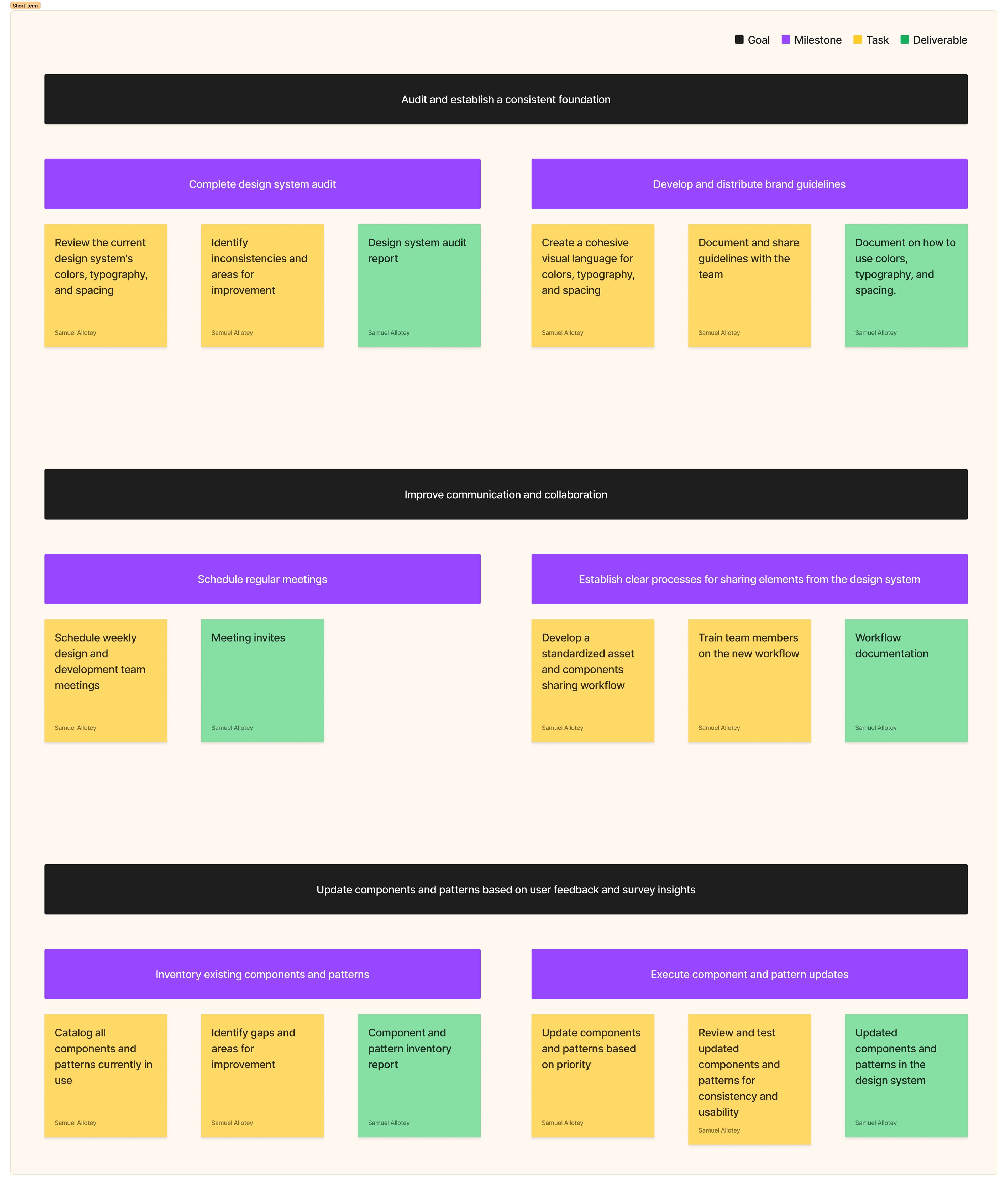
This phase was explicitly framed as the foundation for a second one: streamlining the now-accurate library and removing redundant components and styles. The roadmap the survey produced sequences three goals: finish the audit and establish a consistent foundation, improve communication and collaboration between design and engineering (regular meetings, a standardized sharing workflow, team training), and update components and patterns directly against what the survey surfaced. The branding-level issues the PM flagged, like the CTA color conflicts, are still open and will need a proper visual and usability audit rather than a component-by-component patch.
Reflection
I didn't get hired to read TypeScript for two months. But that work is the reason anything after it could be trusted. A design system doesn't earn credibility by looking polished, it earns it by being accurate often enough that people stop double-checking it against production. Getting StubHub's system to that point, quietly, before anyone saw a single new component, turned out to be the actual design work.
Showing the full case study.